What we collect!
Stamporama Discussion Board Logo
For People Who Love To Talk About Stamps


40 visitors online

United States/Stamps : Flag Stamp Design - Blurry?

AuthorPostings
JohnnyRockets
Members Picture

21 Apr 2020
06:16:04pm
Hi all,

As a fledgling US Flag Stamp collector, I must say I found this design to be a bit lame.

In my opinion it seems blurry in the area of the stars.

Does anyone else notice this, or is it just me? I have multiples and they all appear blurry to me. And no, my eye sight is a corrected 20/20! Happy


Image Not Found


JR

Like
Login to Like
this post
musicman
Members Picture

APS #213005
21 Apr 2020
08:16:30pm
re: Flag Stamp Design - Blurry?

That is the normal image - it was intended that way.

Happy

Like
Login to Like
this post
larsdog
Members Picture

APS #220693 ATA#57179
21 Apr 2020
10:58:18pm
re: Flag Stamp Design - Blurry?

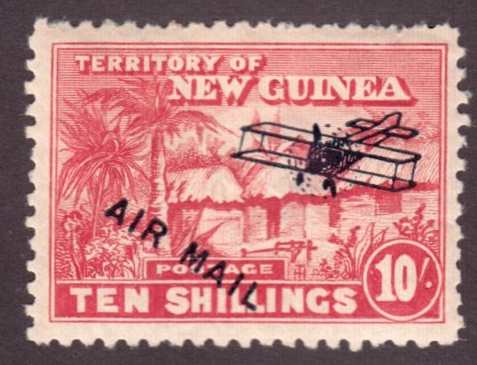
I wouldn't be too hasty there. There are a lot of counterfeits of that era, There is a whole section in the back of the Scott Specialized covering them. It's right before "Test Stamps" in my 2016 Catalog. I have a counterfeit of what I believe is 4489, but only 4491 is listed as counterfeited in my 2016 Catalog. A newer catalog may contain the OP stamp.

I would hang on to that!

Lars

Like
Login to Like
this post

"Expanding your knowledge faster than your collection can save you a few bucks."

www.larsdog.com/stamps
JohnnyRockets
Members Picture

22 Apr 2020
08:45:38am
re: Flag Stamp Design - Blurry?

Interesting!

I has NEVER even considered that possibility.


Thank you all for your input!


JR

Like
Login to Like
this post
        
Please Note:
Postings that were loaded from the old Discussion Board cannot be edited.

Contact Webmaster | Visitors Online | Unsubscribe Emails


User Agreement

Copyright © 2024 Stamporama.com