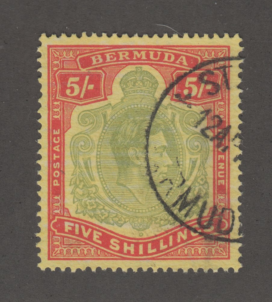
I have copies of this 5s stamp in two shades, one as here and the other in a shade which is much closer to the colour of the 20s stamp from the same set.
I see nothing about shades in this set in my old Scott, SG and Michel catalogues and I wondered if other members have seen the same thing?
My bright green example appears fresh but I realise of course that it could be a colour changeling.
What I'm going to write may just add to the confusion rather than shed light on the issue, but anyway ...
To begin with, the corner cancels (in particular because they are at the lower right instead of the left side, and they are from the capital of the country) may indicate a cancellation for collecting purposes (also referred to as CTO = cancelled to order). This is sometimes done by machines, sometimes by hand. Many countries, including Bulgaria, set aside a part of the print runs of their stamps for this purpose.
Now I have read somewhere (but don't ask me where, because I have forgotten), that some countries, among them Romania, even had special print runs made for their CTO stamps, and the colors as well as the paper quality may differ from those stamps for general use. Perhaps Bulgaria did the same, and in several runs, and they happened to pick an off shade of printing ink for one of them.
Of course, the same could have happened with a print run for general use as well. It might also be a color changeling, but as far as I could observe, green pigments are more resistant than red and yellow ones, and if yellow were involved, I'd expect the changeling to look more blueish. Can you show the 20 stotinki stamp, too? Perhaps you have really found a color variant?
A case for using a spectrometer, if I've ever seen one ...
I assumed they were both CTO stamps. The darker has full gum and the lighter one has no gum.
"I have copies of this 5s stamp in two shades, one as here and the other in a shade which is much closer to the colour of the 20s stamp from the same set."
I'm afraid I was exaggerating here. The stamp is clearly different in colour to my 20s example and is not nearly so bright to my eyes (especially in the scanned image).
However, this was my initial impression in dull light.
"Now I have read somewhere (but don't ask me where, because I have forgotten), that some countries, among them Romania, even had special print runs made for their CTO stamps, and the colors as well as the paper quality may differ from those stamps for general use."
Yes, I'd had the same thought but I also couldn't remember where I had seen this.
Here are the stamps I have:
There's also a 13s value in the set but I don't have one.
I've just dug out the Michel catalog of 2000/2001 and looked up the set. For the 8 st stamp it says "Töne" which means that there are various color shades, but they can't be clearly distinguished because there are transitions. It does not say so for the other stamps in the set. However, this does not necessarily mean that there aren't any.
The 5 st stamp ist listed as "schwarzblaugrün" = black blue green which fits the darker of the two stamps, and the one shown in the first contribution to this thread. The lighter one is what I'd call "blaugrün" = blue green. Maybe it's just a lighter grade of the same ink. That's why I half-jokingly recommended a spectrometer.
For comparison, the 10 st is listed as "schwarzgrün" = black green, the 20 st as "mittelgrün" = medium green. I'd say the scans fit these descriptions.
I happen to have handy a little newer edition of that Michel (Südosteuropa 2012-2013), so I thought I'd check and see if what Martin reported had been updated at all. Sadly, no.
But, fwiw, here's the snippet of the 2012-2013 catalog for that listing.
Perhaps a more specialized catalog for Bulgaria? It's certainly an interesting item to try to track down.
Thanks for sharing it, Nigel!
1 Member likes this post. Login to Like.
"You gotta put down the duckie if you wanna play the saxophone. (Hoots the Owl -- Sesame Street)"
'
While I am familiar with the common wisdom that CTO stamps were sometimes printed on the same press as the originals - just one more run, but with a CDS et al - I don't think that these are those.
I would expect CTOs printed by a plate on a press to be uniformly oriented (dates being level, for example) and uniformly quartered and uniformly inked and uniformly impressed.
Nigel: Anytime I am able to provide any information that helps you is a special day for me, indeed. You have always been so consistently helpful to all of us here and on other platforms over the long haul, for which I am grateful. It was my great pleasure!
1 Member likes this post. Login to Like.
"You gotta put down the duckie if you wanna play the saxophone. (Hoots the Owl -- Sesame Street)"


