I'm finding color confirmations to be very tricky in U.S. especially older. Toning can make everything look darker and exposure to sun can make things look lighter. As a result, comparing to either newer or older stamps isn't always apples-to-pommes. Especially as some stamps with just one color such as ultramarine may appear bright on one stamp and light on another.
Here are two examples, both available in blue and ultramarine, with substantial CV differences depending on how they are categorized. They look substantially the same to me. Anyone willing to take a stab at identifying which color is most likely? I'll see if I can find some other stamps with the same resolution and cropping to put up as comparisons.
How do you distinguish Blue/light blue/ultramarine? I've aimed for the examples as identified in the catalog for a particular issue which doesn't have the varieties/ and gone from there. Not very foolproof, but perhaps a usable tactic?
Dan C
I know this is a contentious issue and we have probably covered similar ground before but I have always considered ultramarine to be a lighter tint of blue. This image may just illustrate what I mean. This was posted on another forum by someone going through the same process as you:
Not sure if it's a "guy" thing - or a "me" thing - but this is as painful as when my wife brings home six 3" x 2" color patches from the paint store and asks me which one I like best for the dining room.
I can't for the life of me translate a small sample to a larger surface so I usually just say they're all nice and hope she doesn't ask if I'd prefer a "cobalt" or a "lapis". I once made the mistake of saying "I'm not fond of red"...
And now, even worse, Michael's dyslexia has rubbed off on me (I will also edit my comment).
Ultramarine, which means "beyond the sea," was originally made with lapis lazuli, among other ingredients. It was a pigment so expensive that it was reserved for the most holy of subjects, such as the raiment of the Virgin Mary, etc. Vermeer almost drove his family into financial ruin because he refused to compromise on ultramarine blue.
It used to be said that it was warmer than blue, but that has been disputed of late. And it appears cooler to me. It is a "deep" blue. Technically, it has a touch of violet in it. Much like vermouth in a martini.
Color swatches are from Pantone.
Cheers!
Eric
PS...I vote with Ningpo on both stamps being blue.
Based on the information herein I'm going to list them in my US Divestiture Program as "Blue" with the following caveat:
"Shade of blue color expertized by Ningpo (Clive) and Winedrinker (Eric) neither of which will receive a commission on the sale. However, if unhappy they will cheerfully refund your money ... in the dollar equivalent of empty gin/vodka bottles as per your State/Province refund mechanism".
"Ultramarine contains a hint of red that the blue doesn't display."
Agreed, and that would be satisfied by violet, which is red + blue. Not that I am pushing violet that much, but came across a couple of sites that were adamant about it being a component of ultramarine blue, and at this point it becomes counting how many angels can dance on the head of a pin. I say 12.
And nice site phos45! I have it bookmarked now. You can actually take the numbers you come up with there and go to color analysis sites online to get the color groups etc.
Your comment about Vermeer and his use of ultramarine blue brought back a memory from my visits to the Rijksmuseum in Amsterdam. The first time that I went I was looking forward to the Rembrandt paintings, especially the Night Watch. However, the paintings that I most enjoyed were those by Vermeer. Vermeer's paintings shined because of the extraordinary blue pigment that was used. That color was so vibrant that it made his paintings stand out among all others. By contrast, the Night Watch, although huge by comparison and itself impressive, took a definite "back seat" in my eyes because Rembrandt's paints by comparison were drab. Even after all of these years I can see why Vermeer insisted on using that particular pigment.
okstamps you are a lucky dog to have seen some Vermeers up close. I'm going to go look at some of those paintings online as soon as I finish this post.
And to belabor the point on ultramarine versus blue. I found some information that backs up Keesindy and Winedrinker as to having some red (violet) in it.
Using the site that phos45 provided earlier, and going to a menu item there that lists "names of colors" then clicking, and employing the RGB analysis:
BLUE = 0, 0, 255
ULTRAMARINE BLUE = 65, 102, 245
So some green in there as well, interestingly enough. The bottom line is that ultramarine is far more complex and mysterious than blue. Like a beautiful woman with a shady past.
You have to be careful about that. RGB (red/green/blue) colors are additive colors using light and primarily used in electronic displays (TV screens and computer monitors). They are called additive because you start with a black screen and keep adding color to get white light. That's why RGB 0,0,0 is black and RGB 255,255,255 is white. (255 is the base 10 equivalent of FF in base 16, which is a multiple of what computers use).
CMYK colors (cyan/magenta/yellow/black) are subtractive (start with a white canvas that reflects all light and add ink that absorbs instead of relecting light) and are primarily used in printing, including many multicolor postage stamps where one color is laid down at a time. 100% each of CMY is close to black, but K (black) is added since black is used so often and provides a crisper black image and better grey-scale results. It also saves a LOT of ink when printing darker colors!
So blue has equal parts cyan and magenta ink at full intensity. Ultramarine has a little less magenta, but adds a little black.
Heavily inked items will appear darker and lightly inked items lighter, so there is often a great deal of variability in older issues.
Just look at the insanity that is the US 3c perforated pre-Civil War stamp:
Scott 25 can be rose, rose red, dull red, brownish carmine or claret. That just shows how much variation there was in 19th Century inks and red is the least stable color when subjected to light. (That's why red is the first color to fade in sunlight and special UV coating is used on stop signs).
Sorry to go on so long.
Lars
3 Members like this post. Login to Like.
"Expanding your knowledge faster than your collection can save you a few bucks."
I have been collecting Guatemala almost 20 years..you would think i would know the difference easily between #31 litho "dull blue" and engraved #43 "blue" but they used the plates so many times and i am certain different inks ! Scott says the impression of the engraved stamps is sharper than that of the litho. Yeah well !
The original purple dye came from sea snails. A priest I know once told me that the cloth dyed in it smelled horrible, but only royalty were allowed to wear it.
Ok Stamps, Rembrandt refused to change his style of painting and became less popular. We went to Boston a year or two ago the museum had a exhibit "The Golden Age of Dutch artists"..wow, what a feast ! Since my wife is from Holland i get to see a lot of Van Gogh and Rembrandt exhibits..Philadelphia ,Sarasota,Williamstown Ma.,Boston etc. I saw the Night Watch...what a shock to see it slashed the way it was.
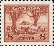
Here is what I found when looking through the collection for examples of blue vs. ultramarine. The outer portion of the stamp is listed as ultramarine while the inner vignette is blue.
George (aka biggeorge)
2 Members like this post. Login to Like.
Please Note: Postings that were loaded from the old Discussion Board cannot be edited.