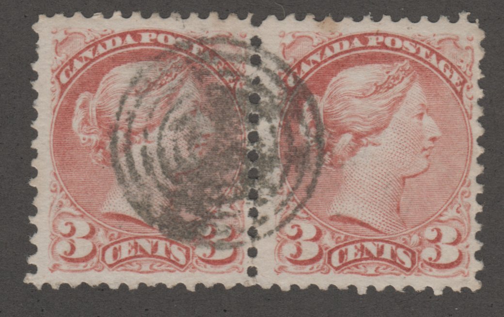
I bought both these stamps listed as 267 but the colors are so different. Is this common? From all the stamps I have these 2 have the most color difference I have seen.
I bought the one on the left to replace the one on the right for the centering. Didn't really notice the color difference until I put them side by side.
I hope you all can see the scan well enough to get a good look. After I was forced into upgrading to windows 10 I can no long set my own setting on my scanner, so I just have to go with what comes up when I push the scan button.
Wow I guess I need to read my Scott catalog more often. I didn't know there were so many color shades for this stamp. Now I have to keep them both. LOL
I wouldn't think someone would certify a 267 as they are not a high dollar stamp. Would be nice to have all the different color shades and know they are correctly identified though.
The problem with colour varieties of stamps is that they are virtually — really? actually? literally? —impossible to identify. Ambient light, fading of the ink, even the colour of the page they're mounted on can affect the collector's perception. Colour guides are no help. Some collectors go to the trouble of developing reference collections to compare new stamps with, but who's to say that the reference collection is accurate? I'll admit that I don't have the patience for collecting such stamps. I tried to collect varieties of Canada's Admiral issue several years ago. I like the stamps a great deal — they're certainly somewhere near the peak of the engraver's art — but identifying them was way beyond my skills and/or my ability to differentiate colours and/or my patience.
There was a good article about this in "The Philatelic Book of Secrets" put out by PSE. It was centered on 279B, which has three times as many shades, but they use UV light to help discern different shades.
Login to Like this post
Please Note: Postings that were loaded from the old Discussion Board cannot be edited.