I must admit that until lately I tended to dismiss all big stamps out of hand. They were clearly not made to lick and affix, merely to attract child collectors impressed by size. Occasionally they drew attention to the country's inflated opinion of itself. Often a poor design was made poorer by being the more visible. I overheard a couple of old guys at a stamp fair loudly excoriating big stamps as 'cheese labels' (that was when I was a not-so-old guy).
Lately a Russian set has been posted in that section of the board which has caused a slight revision of opinion. Despite the fact that the stamps were almost certainly produced for collectors, as well as reflecting a certain self-regard, they were actually beautifully produced (engraving, naturally) and suited their Cinemascope format ideally.
But I think they are exceptions. A stamp really ought to have something to do with postage, don't you think?
Wanting to bring the joy of stamp collecting to younger generations 21 May 2015 06:53:52am
re: Big stamps - What Do You Think?
I'd have to agree with Lars. Especially these days with email and digital postage, mail just looks plain boring. Stamps are hardly on mail anymore. I even get happy for a "presorted standard" when it's on an envelope in my mailbox! Maybe if people notice the stamp it will get people more interested in the hobby?
Do you also prefer cd booklets over vinyl record sleeves?
Personally I think a design is good or bad regardless of its size, although I think that a larger canvas will give the designer more space to do his/her work and small stamps often lead to fiddly work that can only be appreciated with a magnifying glass.
They who would give up essential Liberty, to purchase a little temporary Safety, deserve neither Liberty nor Safety. -Benjamin Franklin 21 May 2015 08:54:28am
re: Big stamps - What Do You Think?
Jansimon is 100% correct, IMHO. The early art stamps of France were some of the most attractive issues of the 20th century (ofc you can hardly say that the artwork was original with the stamp designers). I doubt that the paintings depicted on those stamps would have been as beautiful in a smaller format.
1 Member likes this post. Login to Like.
"The only thing necessary for the triumph of evil is for good men to do nothing. -Edmund Burke"
APS life member of 25+ years 21 May 2015 01:43:58pm
re: Big stamps - What Do You Think?
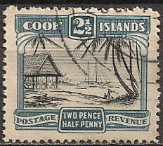
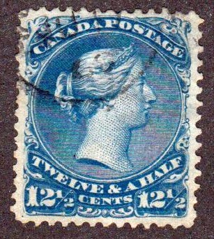
I have never been concerned with the size of a stamp. I have a stamp that is one-quarter of an inch on a side and I have the $10 blue whale definitive from Canada, which is a big as they get. There are mini-sheets and 8.5" x 11" souvenier sheets out there as well.
Some countries issue stamps specifically for collectors and they may be cheap and lack character yet at the same time can be appealing in their own way. Bhutan's phonograph records and CD stamps are gimmicks yet they are avidly sought after and are high value items.
Ignoring a stamp because of its size or other attributes means you have a limited collection that lacks variety and appeal to others, but if you like it, that is all that matters in the end.
@ jansimon - my LP covers are my pride and joy. Though in a box, under the stairs. CD inserts are all very well, but cassette tape inserts were altogether too small!
A good few responses here are concerned with value or sales potential, rather than trying to establish the point or practicality of big stamps. Let's look at it from another angle: why do you suppose the Penny Black was created in its particular dimensions - not bigger or smaller? Did it not provide a normative template for definitive stamps from many countries thereafter?
A stamp mainly for postage should be a "convenient" size especially if it has little to offer in terms of visual content.
However the stamp size & shape should probably primarily reflect the content while still being relatively convenient for postage use. A balance between both is ideal.
Although not necessarily ideal for postage use, these 2 reversed in content would not be appealing.
"Of course if the stamps are too big for your envelope you can always overlap them."
LOL. Not in the USA. Such an envelope would most likely (should) get rejected and returned to sender. I'm not sure, however, how the computerized sorting machines will catch it if a clerk doesn't.
"A good few responses here are concerned with value or sales potential, rather than trying to establish the point or practicality of big stamps. Let's look at it from another angle: why do you suppose the Penny Black was created in its particular dimensions - not bigger or smaller? Did it not provide a normative template for definitive stamps from many countries thereafter?"
Two points:
1. For some issues, big stamps make sense. I expect 19th Century U.S. Newspaper stamps were so big to make them easy to spot in a bundle of newspapers. Esthetically, the Circus commemoratives depicting circus posters SHOULD be large format.
2. For definitives, the size has been rather fixed. In the U.S. our original issue size is pretty much the same size of a modern stamp. We expanded size a bit with the Banknotes and came back down with the Baby Banknotes. In 1981 we attempted to make stamps even smaller (to save on paper costs), but that experiment was roundly rejected by the public.
Was the penny black "perfect" in its conception, or are humans just resistant to change? Be careful in how you draw your conclusions!
Lars
Login to Like this post
"Expanding your knowledge faster than your collection can save you a few bucks."
I like that upper-case SHOULD, Lars! And indeed the possibility of an aesthetic (rather than pragmatic) decision in the phrase "roundly rejected by the public".
I do not suggest that a penny black was perfect in its conception, only that Rowland Hill specified its dimensions for a reason, and indeed altered his original specification from a square stamp (boo! hiss! see my outrage elsewhere!) to a 6:7 linear ratio.
The reason behind this was to incorporate the words 'one penny' at the bottom. The rider "Or if practicable increase the length One eighth and insert in white letters at the bottom One Penny" (in his instructions to Perkins, Baker & Petch) can be interpreted either way: Hill did not like the look of a square stamp and knew a 'portrait' format would be aesthetically more pleasing; or Hill was not really bothered about proportion but felt that a stamp needed a visible denomination.
I don't believe aesthetics are entirely a matter of personal preference, nor do I think subsequent stamp producers mimicked Hill's 6:7 ratio because they were resistant to change. I do think there's a range of proportions outside which stamps just look ugly, and I suspect that goes for size as well.